#Install these two packages if necessary:
#install.packages("FactoMineR")
#install.packages("GDAtools")
#install.packages("factoextra")
#install.packages("explor")

library(tidyverse)
library(FactoMineR)
library(GDAtools)
library(factoextra)
library(explor)
library(questionr)

setwd("/home/groups/3genquanti/SoMix/HIES for workshop")
environment <- readRDS("environment.rds")12 Geometric Data Analysis
In the previous sessions, we modelled a single outcome variable as a function of a set of predictors. In this final session, we introduce a different family of methods: geometric data analysis (GDA), which explores the relationships between many variables simultaneously, without distinguishing between dependent and independent variables.
GDA has a particularly strong tradition in French sociology. It was central to the work of Pierre Bourdieu, who used Multiple Correspondence Analysis to map the structure of French social space in La Distinction (1979) and The State Nobility (1989). For Bourdieu, the power of GDA lay in its ability to reveal the underlying structure of a social field — not by testing pre-specified hypotheses, but by letting the data reveal its own geometry.
The factorial map became a way to visualise the social space: a space where proximity means similarity of condition, and distance means difference.
This tradition remains very alive in French quantitative sociology today, where MCA and related methods are standard tools — perhaps more so than in Anglophone social science, where regression-based approaches dominate. That said, GDA is by no means limited to France or to sociology: it is widely used in public health, political science, marketing research, and ecology across the world.
We cover two complementary techniques:
- Principal Component Analysis (PCA): for continuous variables
- Multiple Correspondence Analysis (MCA): for categorical variables
Both are implemented with the FactoMineR package and explored interactively with explor.
12.1 The Logic of Geometric Data Analysis
Imagine you have 16 variables measuring distances to different facilities (school, hospital, market, bus stop…) from the households surveyed in the HIES (see Section 7 - Access to Primary Facilities). You want to understand:
- Are these distances correlated? Do households far from one facility tend to be far from others?
- Are there profiles of households with similar patterns of access?
With two variables, a scatterplot works. With 16 variables, you would need to look at 120 pairwise plots — impossible to synthesize mentally.
PCA and MCA reduce this high-dimensional space to a few factorial axes that capture the main dimensions of variation. The result is a factor map: a two-dimensional plot where proximity between points reflects similarity in the original data.
PCA vs. MCA
| PCA | MCA | |
|---|---|---|
| Variable type | Continuous | Categorical |
| Input | Correlation matrix | Indicator matrix |
| Points on map | Variables (arrows) + individuals | Categories + individuals |
| Typical use | Scales, indices, distances | Living conditions, practices, attitudes |
In practice, the two methods follow the same geometric logic and are interpreted similarly.
Before diving into the analysis, it is worth clarifying what the outputs will look like. Both PCA and MCA produce two main outputs: a variables map (or categories map for MCA) and an individuals map.
The key reading rule is the same for both: individuals that appear on the same side as a variable (or category) share that characteristic — they score high on that variable, or belong to that category. Individuals that appear on opposite sides have contrasting profiles. The further from the origin, the more extreme the profile.
12.2 PCA: Distance to Facilities
12.2.1 The data
The environment.rds file contains 16 variables measuring the distance (in km) from each household to the nearest facility of each type:
# Select distance variables
dist_vars <- c("bus_halt", "pre_school", "primery_school","secondery_school",
               "hospital","matrenity_home","gov_dispensarz","private_dispensary",
               "maternity_clinic","dmo","mcucpc","ds_office","gn_office",
               "post_office","bank","agri_office")

pca_data <- environment |>
  select(hhid, all_of(dist_vars)) |>
  drop_na()
12.2.2 Supplementary variables
Before running the PCA, we set aside the socio-demographic and geographic variables to use as supplementary (illustrative) variables — they will be projected onto the factorial map after the determination of the axes, without influencing the construction of the axes:
environment$sector_rec <- environment$sector  |>
  as.character() |>
  fct_recode(
    "Urban" = "1",
    "Rural" = "2",
    "Estate" = "3"
  )

pca_sup <- environment |>
  filter(hhid %in% pca_data$hhid) |>
  select(hhid,province, sector_rec, max_edu, hhwealthcat)

pca_data <- pca_data |>
  left_join(pca_sup,by='hhid') |>
  column_to_rownames(var="hhid")

names(pca_data)
[1] "bus_halt" "pre_school" "primery_school"
[4] "secondery_school" "hospital" "matrenity_home"
[7] "gov_dispensarz" "private_dispensary" "maternity_clinic"
[10] "dmo" "mcucpc" "ds_office"
[13] "gn_office" "post_office" "bank"
[16] "agri_office" "province" "sector_rec"
[19] "max_edu" "hhwealthcat"
Active vs. supplementary variables
A key principle in geometric data analysis is the distinction between:
- Active variables: used to construct the factorial axes — here, the 16 distance variables
- Supplementary variables: projected onto the map after the fact, without influencing the axes — here, socio-demographic and geographic variables
This distinction reflects a theoretical choice: we want the axes to capture the structure of access to facilities, and then use socio-demographic variables to interpret this structure, not to define it. This is the standard approach in social science applications: practices and conditions as active variables, socio-demographic characteristics as supplementary.
A factorial axis is a new synthetic variable, constructed as a weighted combination of the original variables, that captures as much variation as possible in the data.
The first axis captures the most variation, the second axis captures the most of what remains, and so on.
In practice, we focus on the first two or three axes, which together summarise the main structure of the data.
12.2.3 Running the PCA
# Extract weights as a separate vector (same row order as pca_data)
weights_vec <- environment |>
  filter(hhid %in% rownames(pca_data)) |>
  pull(finalweight_25per)

pca_result <- PCA(
  pca_data ,
  scale.unit = TRUE,     # standardize variables (important when units differ)
  ncp = 5,               # retain 5 dimensions
  graph = FALSE,
  quali.sup = c(17:20),
  quanti.sup = NULL,
  row.w=weights_vec
)
Note
scale.unit = TRUE is essential here: even though all variables are in km, their ranges may differ substantially, and standardization ensures that no single variable dominates the axes simply because of its scale.
12.2.4 Scree plot: how many dimensions?
fviz_screeplot(pca_result, addlabels = TRUE) +
  labs(title = "PCA — Variance explained by each dimension")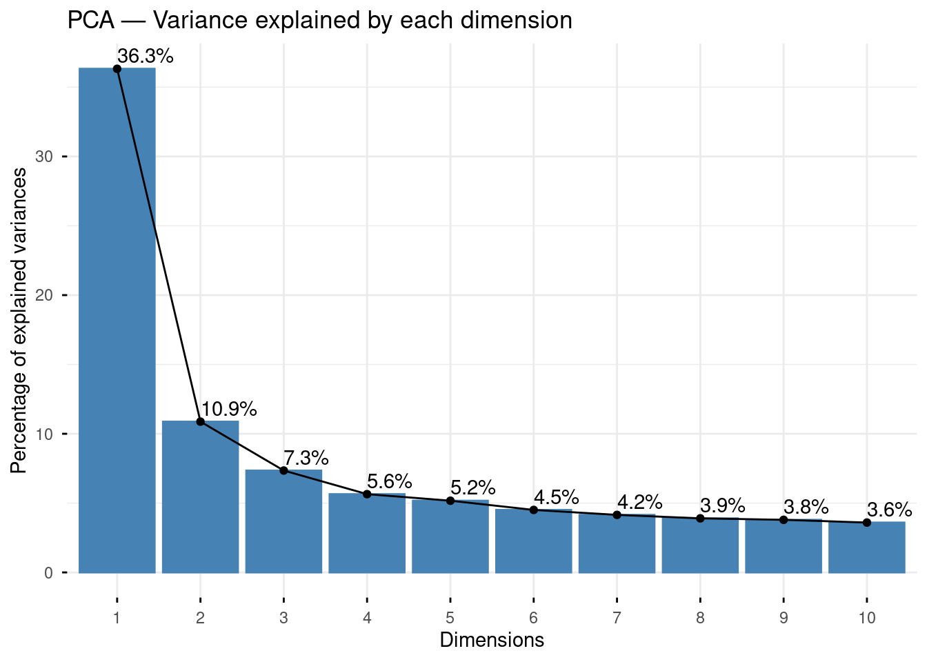
The scree plot shows the percentage of total variance captured by each dimension. We often focus on the first two or three dimensions, which together summarise the main structure of the data. Look for an “elbow” in the curve — the point after which additional dimensions add little information. Here, the first axis clearly predominates, but the second and third also seem to convey quite some information compared to the subsequent ones, let’s see if it adds anything interesting.
12.2.5 Exploring results with explor
Rather than producing a series of static plots, we use explor to explore the PCA results interactively:
explor(pca_result)This opens an interactive interface in your browser where you can:
- Rotate between dimensions
- Hover over points to identify variables and individuals
- Filter by contribution or quality of representation (cos²)
- Color individuals by any supplementary variable
The variables map (Figure 1) shows each of the 16 distance variables as an arrow. Two rules for reading it:
(1) variables pointing in the same direction are positively correlated — households far from one tend to be far from the other;
(2) the length of the arrow indicates how well the variable is represented on these two axes — short arrows are better represented on other dimensions.
The circle of correlations (the grey circle) is the reference: variables close to the circle are well-represented, variables close to the centre are not.
The individuals map (Figure 2) shows each household as a point. A household on the right side of the map (positive Axis 1) is far from most facilities; a household on the left is close to them. The color or shading reflects the density of points — darker areas contain more households.


12.2.6 Interpreting the axes
To interpret what each dimension represents, examine which variables are at the positive and negative poles of each axis. In the variables map:
- Variables pointing in the same direction are positively correlated
- Variables pointing in opposite directions are negatively correlated
- Variables close to the origin are poorly represented on these two dimensions (check their cos²)
Let’s interpret the factorial maps based on these principles:
Axis 1 (38% of variance) is the dominant dimension and clearly captures overall remoteness from facilities: all active variables point to the right (positive pole), meaning households on the right side of the map are far from everything. The supplementary variables confirm this interpretation perfectly — Urban, Western province, and high wealth categories (Rich, Richest) sit on the negative pole (good access), while Estate, Poorest, and Uva/North Central project on the positive pole (poor access).
Axis 2 (11%) introduces a secondary contrast between two clusters of facilities: educational and transport infrastructure (primary school, pre-school, bus halt, post office) are more remote in the upper part of the factorial map and associated with Uva and Estate households (figure 1), vs. households more remote from health facilities (hospital, bank, maternity home, MOH office) in the lower part, corresponding to North Central and Northern households.
Axis 3 (8%) reveals a dimension specific to the Estate sector, which projects strongly at the top — Estate households are distinct from both Rural and Urban on this third dimension, which are more remote from local authority bodies, likely reflecting the specific geographic configuration of plantation areas. Again on this axis, the remoteness of Northern (and here, also Eastern) households in terms of health infrastructures appears relatively more salient.
Contribution and cos²
Two statistics help identify the most important variables:
- Contribution (
contrib): how much does this variable contribute to constructing this axis? Variables with high contribution are the ones that “define” the axis. Usually, we interpret variables which have a contribution higher than the average contribution (if all variables contributed equally), i.e. here 100/16=6.25 - cos²: quality of representation of the variable on this axis. A low cos² means the variable is better represented on other dimensions.
The individual maps reveal a strongly asymmetric distribution: the vast majority of households cluster near the origin (moderate distances, average profiles), while a small number of outliers extend far along Axis 1 — these are households with exceptionally long distances to facilities, likely in very remote rural or estate areas. One should be careful in interpreting further the factorial maps and see whether those households contribute to structure the factorial planes to disproportionally (in that case, they can be put as supplementary “statistical individuals”).
12.3 MCA: Housing Conditions
12.3.1 The data
We now turn to categorical variables describing housing conditions (Section 8).
These include:
Type of structure (single house…)
Number of bed rooms
Total floor area
Principle materials of construction
Floor
Roof
Tenure
We also need to add modality labels for these 7 variables. In passing, we check that the modalities are not too rare in the population (say, not less than 5 percent), otherwise such categories can distort the axes by pulling them towards a handful of atypical cases.
environment$structure_rec <- environment$structure  |>
as.character() |>
fct_recode(
  "House_1floor" = "1",
  "House_2floor" = "2",
  "House_3afloor" = "3",
  "AttachedHouse" = "4",
  "Flat" = "5",
  "TwinHouses" = "7",
  "LineRoom" = "8",
  "Slum" = "9"
)
environment |> freqtable(structure_rec,weights=finalweight_25per) |> freq()
n % val%
House_1floor 4939555.9 86.5 86.5
House_2floor 465578.6 8.2 8.2
House_3afloor 41331.0 0.7 0.7
AttachedHouse 40779.7 0.7 0.7
Flat 19045.8 0.3 0.3
TwinHouses 22079.7 0.4 0.4
LineRoom 149754.9 2.6 2.6
Slum 32152.1 0.6 0.6environment <- environment |>
mutate(
structure_rec2 = fct_collapse(structure_rec,
"Single floor" = "House_1floor",
"Double floor+" = c("House_2floor", "House_3afloor"),
"Other" = c("AttachedHouse", "Flat", "TwinHouses", "LineRoom", "Slum")
)
)
environment |> freqtable(structure_rec2,weights=finalweight_25per) |> freq() n % val%
Single floor 4939555.9 86.5 86.5
Double floor+ 506909.5 8.9 8.9
Other 263812.2 4.6 4.6environment$bed_rooms_rec <- cut(environment$bed_rooms,
include.lowest = TRUE,
right = FALSE,
dig.lab = 4,
breaks = c(0, 2, 3, 10),
labels=c("Bedroom0-1","Bedroom2","Bedroom3plus")
)
environment |> freqtable(bed_rooms_rec,weights=finalweight_25per) |> freq() n % val%
Bedroom0-1 954051.8 16.7 16.7
Bedroom2 2059960.9 36.1 36.1
Bedroom3plus 2696265.0 47.2 47.2environment$area_rec <- environment$area |>
as.character() |>
fct_recode(
"<100" = "1",
"100-250" = "2",
"250-500" = "3",
"500-750" = "4",
"750-1000" = "5",
"1000-1500" = "6",
"1500-3000" = "7",
"3000+" = "9"
)
environment |> freqtable(area_rec,weights=finalweight_25per) |> freq() n % val%
<100 101745.7 1.8 1.8
100-250 360180.8 6.3 6.3
250-500 801396.9 14.0 14.0
500-750 1193790.2 20.9 20.9
750-1000 1369542.4 24.0 24.0
1000-1500 1265193.2 22.2 22.2
1500-3000 541244.1 9.5 9.5
3000+ 77184.4 1.4 1.4environment <- environment |>
mutate(
area_rec2 = fct_collapse(area_rec,
"Small (<250)" = c("<100", "100-250"),
"Medium (250-750)" = c("250-500", "500-750"),
"Large (750-1500)" = c("750-1000", "1000-1500"),
"Very large (1500+)" = c("1500-3000", "3000+")
)
)
environment |> freqtable(area_rec2,weights=finalweight_25per) |> freq() n % val%
Small (<250) 461926.5 8.1 8.1
Medium (250-750) 1995187.0 34.9 34.9
Large (750-1500) 2634735.5 46.1 46.1
Very large (1500+) 618428.5 10.8 10.8environment$walls_rec <- environment$walls |>
as.character() |>
fct_recode(
"Brick" = "1",
"Cement" = "2",
"Stone" = "3",
"Cabook" = "4",
"Pressedsoil" = "5",
"Cadjan" = "6",
"Wood" = "7",
"Metal" = "8",
"Other" = "9"
)
environment |> freqtable(walls_rec,weights=finalweight_25per) |> freq() n % val%
Brick 2898891.9 50.8 50.8
Cement 2280581.1 39.9 39.9
Stone 145167.9 2.5 2.5
Cabook 105317.7 1.8 1.8
Pressedsoil 199056.8 3.5 3.5
Cadjan 9376.6 0.2 0.2
Wood 58146.6 1.0 1.0
Metal 1073.3 0.0 0.0
Other 12665.7 0.2 0.2environment <- environment |>
mutate(
walls_rec2 = fct_collapse(walls_rec,
"Brick" = "Brick",
"Cement" = "Cement",
"Other/Traditional" = c("Stone", "Cabook", "Pressedsoil",
"Cadjan", "Wood", "Metal", "Other")
)
)
environment |> freqtable(walls_rec2,weights=finalweight_25per) |> freq() n % val%
Brick 2898891.9 50.8 50.8
Cement 2280581.1 39.9 39.9
Other/Traditional 530804.7 9.3 9.3environment$floor_rec <- environment$floor |>
as.character() |>
fct_recode(
"Cement" = "1",
"Teraso" = "2",
"Mud" = "3",
"Wood" = "4",
"Sand" = "5",
"Concrete" = "6",
"Other" = "9"
)
environment |> freqtable(floor_rec,weights=finalweight_25per) |> freq() n % val%
Cement 3813865.3 66.8 66.8
Teraso 1280791.6 22.4 22.4
Mud 125329.0 2.2 2.2
Wood 7344.1 0.1 0.1
Sand 26767.7 0.5 0.5
Concrete 448129.7 7.8 7.8
Other 8050.1 0.1 0.1environment <- environment |>
mutate(
floor_rec2 = fct_collapse(floor_rec,
"Cement" = "Cement",
"Teraso/Tile" = "Teraso",
"Other/Traditional" = c("Mud", "Wood", "Sand", "Concrete", "Other")
)
)
environment |> freqtable(floor_rec2,weights=finalweight_25per) |> freq() n % val%
Cement 3813865.3 66.8 66.8
Teraso/Tile 1280791.6 22.4 22.4
Other/Traditional 615620.7 10.8 10.8environment$roof_rec <- environment$roof |>
as.character() |>
fct_recode(
"Tile" = "1",
"Asbestos" = "2",
"Concrete" = "3",
"Metal" = "4",
"Takaran" = "5",
"Cadjan" = "6",
"Other" = "9"
)
environment |> freqtable(roof_rec,weights=finalweight_25per) |> freq() n % val%
Tile 2402717.4 42.1 42.1
Asbestos 2647211.6 46.4 46.4
Concrete 256373.8 4.5 4.5
Metal 83230.9 1.5 1.5
Takaran 298347.7 5.2 5.2
Cadjan 18439.9 0.3 0.3
Other 2907.9 0.1 0.1
NA 1048.4 0.0 NAenvironment <- environment |>
mutate(
roof_rec2 = fct_collapse(roof_rec,
"Tile" = "Tile",
"Asbestos" = "Asbestos",
"Takaran" = "Takaran",
"Other" = c("Concrete", "Metal", "Cadjan", "Other")
)
)
environment |> freqtable(roof_rec2,weights=finalweight_25per) |> freq() n % val%
Tile 2402717.4 42.1 42.1
Asbestos 2647211.6 46.4 46.4
Other 360952.5 6.3 6.3
Takaran 298347.7 5.2 5.2
NA 1048.4 0.0 NAenvironment$ownership_rec <- environment$ownership |>
as.character() |>
fct_recode(
"ConstructedorPurchased" = "1",
"Inherited" = "2",
"Freely" = "3",
"Compensated" = "4",
"RentFree" = "5",
"ReliefPayment" = "6",
"Rent" = "7",
"Lease" = "8",
"Encroached" = "9",
"Other" = "99"
)
environment |> freqtable(ownership_rec,weights=finalweight_25per) |> freq() n % val%
ConstructedorPurchased 3527892.5 61.8 61.8
Inherited 1280792.5 22.4 22.4
Freely 276969.6 4.9 4.9
Compensated 38803.4 0.7 0.7
RentFree 260943.8 4.6 4.6
ReliefPayment 20038.1 0.4 0.4
Rent 213376.8 3.7 3.7
Lease 5496.9 0.1 0.1
Encroached 48047.6 0.8 0.8
Other 37916.4 0.7 0.7environment <- environment |>
mutate(
ownership_rec2 = fct_collapse(ownership_rec,
"Owned" = "ConstructedorPurchased",
"Inherited" = "Inherited",
"Other" = c("Freely", "Compensated", "RentFree",
"ReliefPayment", "Rent", "Lease",
"Encroached", "Other")
)
)
environment |> freqtable(ownership_rec2,weights=finalweight_25per) |> freq() n % val%
Owned 3527892.5 61.8 61.8
Inherited 1280792.5 22.4 22.4
Other 901592.6 15.8 15.8mca_vars <- c("structure_rec2", "bed_rooms_rec", "area_rec2",
"walls_rec2", "floor_rec2", "roof_rec2",
"ownership_rec2")
mca_data <- environment |>
select(hhid,finalweight_25per, all_of(mca_vars)) |>
drop_na()12.3.2 Checking for rare categories
There might still be modalities which account for less than 5 percent of the households:
mca_data |>
  select(-hhid) |>
  pivot_longer(-finalweight_25per, names_to = "variable", values_to = "category") |>
  count(variable, category,wt=finalweight_25per) |>
  mutate(pct = n / sum(n) * 100, .by = variable) |>
  filter(pct < 5) |>
  arrange(variable, pct)
# A tibble: 1 × 4
variable category n pct
<chr> <fct> <dbl> <dbl>
1 structure_rec2 Other 263812. 4.62Categories with less than 5% frequency should be set as supplementary modalities — they will be projected onto the map without influencing the axes. Here, our preliminary recoding is quite efficient because only one remains below the 5% threshold (type of structure other).
Why exclude rare categories from active variables?
A category present in only 2–3% of households will inevitably appear far from the origin on the factor map — not because it captures an important dimension of variation, but simply because it is unusual. This can create a “horseshoe effect” where the first axis is dominated by a single rare category rather than the main structure of the data.
Setting rare categories as supplementary preserves their visibility on the map (you can still see where they project) without letting them distort the axes.
12.3.3 Supplementary variables
As in the PCA, we project socio-demographic and geographic variables as supplementary:
mca_sup <- environment |>
  filter(hhid %in% mca_data$hhid) |>
  select(hhid,province, sector_rec, max_edu, hhwealthcat)

# Combine active and supplementary data for MCA
#Remove the weight variable from this file
mca_full <- mca_data |>
  select(-finalweight_25per) |>
  left_join(mca_sup,by="hhid") |>
  column_to_rownames(var="hhid")


#We identify the "index" of the rare modality:
modexcl<-which(getindexcat(mca_full)=="structure_rec2.Other")

names(mca_full)
[1] "structure_rec2" "bed_rooms_rec" "area_rec2" "walls_rec2"
[5] "floor_rec2" "roof_rec2" "ownership_rec2" "province"
[9] "sector_rec" "max_edu" "hhwealthcat" 12.3.4 Running the MCA
# Extract weights as a separate vector (same row order as pca_data)
weights_vec <- environment |>
  filter(hhid %in% rownames(mca_full)) |>
  pull(finalweight_25per)

mca_result <- MCA(
  mca_full,
  ncp       = 5,
  graph     = FALSE,
  excl=modexcl,
  quali.sup = 8:11,
  row.w = weights_vec
)
12.3.5 Exploring results with explor
explor(mca_result)

In MCA, the map shows categories rather than variable arrows. Each modality of each variable is a point. Two categories that are close together tend to co-occur in the same households — for instance, if “Takaran roof” and “Small (<250)” are close, households with Takaran roofs tend to also have low surface. Categories close to the origin are either very frequent (around 50%) or weakly structured by these axes.
12.3.6 Reading the factor map
In the MCA category map:
- Categories that appear close together tend to co-occur in the same households
- Categories far from the origin are strongly structured by the axes — they contribute a lot
- Categories near the origin are either very common (close to 50% frequency) or weakly structured
The supplementary variable categories (province, max education, sector, wealth) appear in a different color. Their position on the map tells us how these characteristics relate to the main structure of housing conditions — without having influenced that structure.
12.3.7 Interpreting the dimensions
Again, we usually concentrate on the modalities which contribute to structure each axis, the figures below help identifying which ones are most relevant:
# Contributions to dimension 1
fviz_contrib(mca_result, choice = "var", axes = 1, top = 15) +
  labs(title = "Contribution of categories to Dimension 1")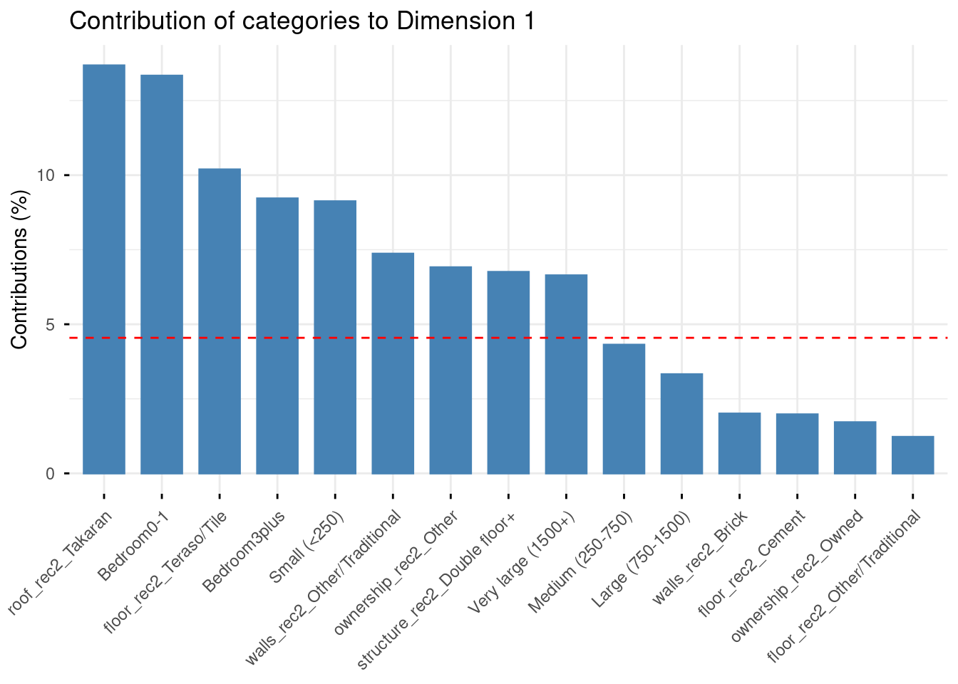
# Contributions to dimension 2
fviz_contrib(mca_result, choice = "var", axes = 2, top = 15) +
  labs(title = "Contribution of categories to Dimension 2")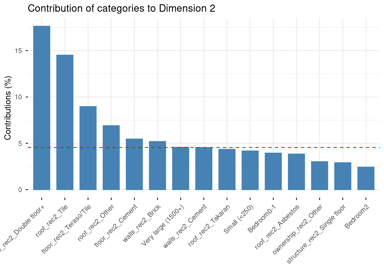
Axis 1 (15.1%) opposes two clearly distinct housing profiles. On the negative pole (left): large houses with double floors, asbestos or tile roofs, brick or cement walls, Teraso/Tile floors — characteristics associated with wealthier, urban households (Richest, Urban, Western province project here). On the positive pole (right): small houses with Takaran roofs, traditional walls, few bedrooms, and Estate sector households. This axis captures a general housing quality gradient, from modern/urban housing to traditional/plantation housing.
Axis 2 (10.7%) is more specific: it opposes double-floor large houses (top) to single-floor houses with tile roofs and brick walls (bottom). This suggests a secondary dimension contrasting vertical expansion (wealthier households building upward) from horizontal, ground-level modern housing.
Guttman effect
The slightly curved, arc-like arrangement of categories visible in the map is known as the Guttman effect or horseshoe effect — a common pattern in MCA when one dominant underlying dimension structures the data.
Categories that are extreme on Axis 1 (very poor or very wealthy housing) tend to curve upward on Axis 2, creating an arch shape. T
his is not an artefact but a mathematical property of MCA: it signals that Axis 2 is partly a quadratic transformation of Axis 1, and that the data is strongly structured by a single underlying gradient (here, housing quality).
Exercise
Examine the Axes 2–3 factor map in explor.
Which categories contribute most to Axis 3? What new dimension does it capture, beyond the quality gradient already described by Axis 1?
Where do Estate households project on the Axes 2–3 map? How does their position differ from Rural and Urban households?
Does the horseshoe effect persist on the Axes 2–3 map, or does Axis 3 reveal genuinely new information?
12.4 From Geometric Data Analysis to further analyses
12.4.1 MCA and the sociology of lifestyles or living conditions
MCA was popularized in sociology by Pierre Bourdieu, who used it to map out the “social space” in La Distinction (1979). The core idea is that individuals are not just characterized by a single variable (income, education…) but by a constellation of practices and conditions that form coherent profiles. MCA reveals these profiles geometrically, by identifying the main axes along which individuals and categories differ.
In our case, housing conditions are a classic object of this type of analysis: the type of roof, walls, floor, and tenure are not independent choices but form coherent combinations that reflect households’ material position in the social structure. The projection of socio-demographic variables (wealth, education, province, sector) as supplementary illustrates a key principle of geometric data analysis: we let the material conditions define the space, and then ask where social groups fall within it — rather than building the space around the groups themselves.
This is why the supplementary variables (Richest, Urban, Tertiary…) project so cleanly onto the negative pole of Axis 1: the housing quality gradient we identified is not constructed from wealth or education, yet it perfectly reproduces the social hierarchy. This coherence between the space of conditions and the space of social positions is precisely what Bourdieu called the homology between fields.
12.4.2 A possible workflow when doing GDA
PCA and MCA are exploratory tools. Their goal is to reveal structure, more than to test hypotheses. A typical workflow is:
1. Run MCA to identify the main dimensions of variation The factorial axes summarise the main contrasts in the data. In our case for the MCA, Axis 1 captures a general housing quality gradient; Axis 2 a secondary contrast in housing type.
2. Interpret the axes substantively This requires reading the contribution plots, examining which categories define each pole, and formulating a sociological interpretation. This step is a craft — there is no algorithm for it.
3. Examine supplementary variables How do social groups (by wealth, education, province, sector) distribute across the factorial space? This reveals which social characteristics are most associated with the dimensions identified — without having constructed those dimensions.
4. Clustering Individual coordinates on the factorial axes can be used as input to a clustering algorithm (typically hierarchical clustering, HCPC() in FactoMineR) to build typologies — groups of households with similar housing profiles. These typologies can then be used as categorical variables in subsequent analyses.
5. Use scores in regression Individual coordinates on Axis 1 (the housing quality score) can be extracted and used as a dependent or independent variable in a regression model — for example to study which household characteristics predict position on the housing quality gradient, or to use housing quality as a control variable in a model of health outcomes.
Steps 4 and 5 are optional and depend on the research question — sometimes the factor map itself is the main result.
12.4.3 Want to go further?
Practical online tutorials in R:
Exercise
In your group projects, are there bundles of variables that you would think are relevant to analyse together?
Are they numeric or categorical? If mixed, how could you still run geometric data analysis?