# On liste les packages dont on a besoin dans un vecteur nommé load.lib.
load.lib <- c("tidyverse","questionr","Hmisc","esquisse","kableExtra")
install.lib <- load.lib[!load.lib %in% installed.packages()] # On regarde les paquets qui ne sont pas installés
for (lib in install.lib) install.packages(lib,dependencies=TRUE) # On installe ceux-ci
sapply(load.lib,require,character=TRUE) # Et on charge tous les paquets


setwd("/home/groups/3genquanti/SoMix/HIES for workshop")
edu<-readRDS("edu.rds")3 Bivariate statistics and more graphics
In this section, we now review a slightly more complex type of descriptive statistics: bivariate statistics i.e. statistics with at least two distinct variables. We sill use data from the educ.rds dataset. We also use the same packages that we introduced in the previous section (section 2) on univariate statistics.
Exercise
Create an empty R script.
Save this script in a folder (for instance, “WinterWorkshop”) and name it for instance “3Statbis.R”.
Load the edu database and run the commands below to install/load packages.
3.1 The association between a categorical variable and a numerical variable
In section 2 on univariate statistics, we discussed several indicators of the distribution of a numerical variable (minimum, maximum, mean, median). Thanks to the lines of code already set up, it is easy to calculate these statistics for different categories of another categorical variable.
You simply need to add another function to compute these statistics for each category of a variable, namely group_by:
edu |>
  group_by(province) |>
  summarise(
    min    = min(distance, na.rm = TRUE),
    mean   = wtd.mean(distance,weights=finalweight_25per,na.rm = TRUE),
    median = wtd.quantile(distance,probs=.5,weights=finalweight_25per,na.rm = TRUE),
    max    = max(distance, na.rm = TRUE),
    n_na   = sum(is.na(distance))
  )
Let’s study the distance to school according to the place of residence: urban, rural, or estate. This corresponds to the variable sector, with categories 1, 2, and 3. We can recode these categories using the icut() interface, or directly with the following code:
edu$sector_rec <- edu$sector  |>
  as.character() |>
  fct_recode(
    "Urban" = "1",
    "Rural" = "2",
    "Estate" = "3"
  )

edu |>
  group_by(sector_rec) |>
  summarise(
    min    = min(distance, na.rm = TRUE),
    mean   = wtd.mean(distance,weights=finalweight_25per,na.rm = TRUE),
    median = wtd.quantile(distance,probs=.5,weights=finalweight_25per,na.rm = TRUE),
    max    = max(distance, na.rm = TRUE),
    n_na   = sum(is.na(distance))
  )
We can analyse how the distance to school varies across multiple categorical variables. For example, we can compute the mean and the median with respect to both the province and the place of residence:
edu |>
  group_by(province,sector_rec) |>
  summarise(
    mean   = wtd.mean(distance,weights=finalweight_25per,na.rm = TRUE),
    median = wtd.quantile(distance,probs=.5,weights=finalweight_25per,na.rm = TRUE)
  ) |>
  kbl(digits=1) |> kable_classic(full_width = F)
The distance to school tends to be higher in rural areas, and this difference is mainly driven by extreme values. Indeed, it is primarily the mean, which is more sensitive to large values, that reflects this gap, more so than the median.
edu |>
  group_by(province,sector_rec) |>
  summarise(
    mean   = wtd.mean(distance,weights=finalweight_25per,na.rm = TRUE)
  ) |>
  pivot_wider(names_from=sector_rec,values_from=mean) |>
  mutate(`Urban-Rural difference`=Urban-Rural) |>
  kbl(digits=1) |> kable_classic(full_width = F)
We can clearly see from this last analysis that this pattern holds in all provinces (except North Western), but the gap varies: it is higher in the Sabaragamuwa and Southern provinces, where the distance to school for children in estate areas is particularly pronounced.
3.1.1 Summarizing with the mean and the standard deviation
It is quite common in scientific articles to describe quantitative variables by reporting the mean (a measure of central tendency) and the standard deviation (a measure of dispersion, equal to the square root of the variance).
edu |>
  group_by(sector_rec) |>
  summarise(
    mean= mean(distance,na.rm=T),
    sd= sd(distance,na.rm=T),
  ) |>
  kbl(digits=1) |> kable_classic(full_width = F)
Why are these two indicators used in particular? First, we can say from this table that, on average, the distance to school is higher for children in rural areas than in urban areas. There is also greater variability in the distance to school in rural areas (sd stands for standard deviation).
Tip
Should we summarize a variable by its mean or its median?
The first option is very common (especially in English-language journals) but is not necessarily the most appropriate…
When working with skewed (i.e., non-normal) distributions:
The mean is sensitive to extreme values in the distribution.
It may be best to have a look at both and plot the distributions!
Note: in fact, the standard deviation is then also not really a reliable indicator of dispersion describing the distribution. One may then prefer to calculate quantiles (e.g. quartiles, following Tukey’s 5 number summary!).
Exercise
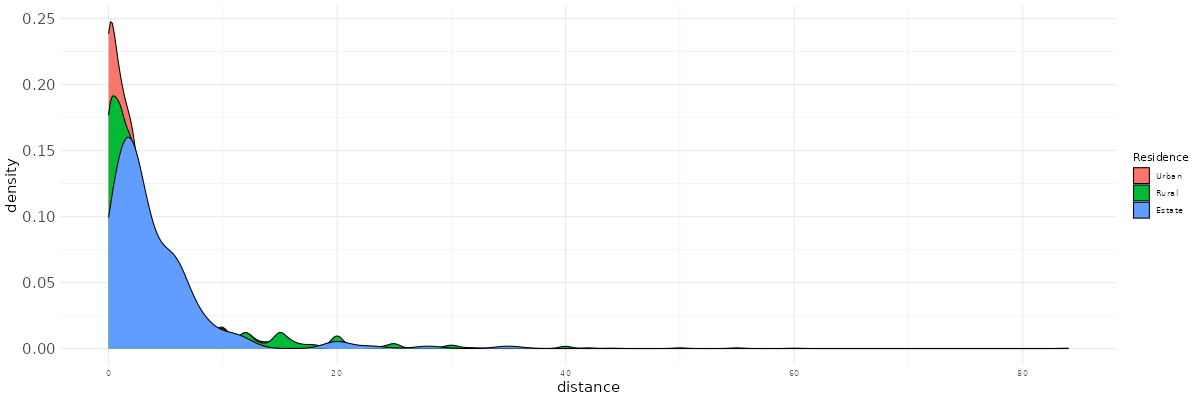
Using esquisser, reproduce the following plot. Try to improve it by playing with color palettes, font sizes…
What is your take away from this plot and from the previous statistics?
3.2 The association between two categorical variables and the cross-tabulation
3.2.1 Some conventions for cross-tabulations
We now come to cross-tabulations to study the associations between two categorical variables.
First, let’s recall a few analysis conventions. It’s easy to get confused when creating cross-tabulations, so keep the following points in mind:
What is my response variable (also called dependent variable), i.e., the variable assumed to depend on another factor or, in other words, the variable that we want to explain?
What is my independent variable, i.e., the variable assumed to have an effect on the dependent variable?
Here, we can for example make the assumption that attending school (variable r2_school_education) depends on different variables such as the parents’ level of education, but also parental economic status, the place of residence, etc.
To visualize whether a factor affects a dependent variable, we can create a cross-tabulation in which:
The dependent variable is placed in the columns.
The independent variable is placed in the rows.
Row percentages are calculated (we need to normalize the row counts to compare them!).
We then compare the rows within the same column.
Of course, this is theory.
There are many cases where we might be more interested in column percentages, or even total percentages, or we may want to swap rows and columns. Nevertheless, keeping these simple conventions in mind helps to stay oriented when navigating statistical analyses.
3.2.2 A practical application of the cross-tabulation
Let’s try to do some cross-tabulations then. We again use the functions from the questionr package. To create a cross-tabulation of unweighted counts, we can write:
edu$r2_school_education_rec <- edu$r2_school_education  |>
  as.character() |>
  fct_recode(
    "Currently attending" = "1",
    "Never attended" = "2",
    "Attended school in the past" = "3"
  )

edu |> freqtable(sector_rec,r2_school_education_rec) |>
  kbl() |> kable_classic(full_width = F)
The row variable (here sector_rec) is the independent variable — it is written first — while the column variable (here r2_school_education_rec) is the dependent variable.
The table of counts is useful because it shows that some cells contain relatively small numbers of observations, which should make us cautious when interpreting the corresponding rows/columns.
To obtain total percentages (joint percentages):
edu |> freqtable(sector_rec,r2_school_education_rec,weights=finalweight_25per) |>
  prop() |>
  kbl(digits=1) |> kable_classic(full_width = F)
From this table, we can say that the most frequent combination of residential location and children’s schooling status is children living in rural areas who are currently enrolled in school (68% of all children).
We can also compute column percentages:
edu |> freqtable(sector_rec,r2_school_education_rec,weights=finalweight_25per) |>
  cprop() |>
  kbl(digits=1) |> kable_classic(full_width = F)
Here, we see that among children who are currently in school, 79% live in rural areas (and 79% of all children, regardless of schooling status, live in rural areas).
Among children who have never attended school, 83% live in rural areas. Children from rural areas are therefore slightly over-represented among those who have never attended school.
Conversely, they are slightly under-represented among children who are not currently enrolled but have been enrolled in the past (78%).
Finally, row percentages make interpretation easier when assessing whether there is an association between residential location and schooling:
edu |> freqtable(sector_rec,r2_school_education_rec,weights=finalweight_25per) |>
  lprop() |>
  kbl(digits=1) |> kable_classic(full_width = F)
Here, we see that, regardless of residential location, the most frequent situation for children is to be currently enrolled in school.
Only 3% of children have never attended school, and this configuration is slightly less common in urban areas and estates. In other words, never having attended school — a very marginal situation overall — is mainly a rural phenomenon.
Salaires |> freqtable(race,salaire_quint) |> prop(n=T,digit=0)3.2.3 From the table to the graphic
Esquisse can again in these cases be used to represent graphically the association between residence and school attendance. Here, our category of interest is specifically “never attending school”.
You first need to store the row-percentage tabulation (transformed as a “data.frame” using the as.data.frame() function) in an object (rtab), then open esquisser with this specific command.
rtab<-edu |> freqtable(sector_rec,r2_school_education_rec,weights=finalweight_25per) |>
  lprop() |> as.data.frame()
esquisser(rtab)
You can then drop the residence variable on the X-axis tab and Freq in the Y-axis tab. Using the “Data” section at the bottom, remove all the categories of the r2_school_education_rec variable, except “Never attending school”. You can further refine the graphic by increasing the font, changing the axis labels, adding a title…

3.2.4 Cross-tabulation with three variables?
Very often, we study social processes that depend on multiple social factors. For instance, school attendance may vary according to age (see above exercise), but age may impact differently school attendance for male and female children.
- One first easy solution to study this is simply to filter the row percentage cross tabulations according to the different categories of a third variable (here, sex).
For instance:
edu |>
  filter(sex=="Male") |>
  freqtable(age,r2_school_education_rec,weights=finalweight_25per) |>
  lprop() |>
  kbl(digits=0) |> kable_classic(full_width = F)
edu |>
  filter(sex=="Female") |>
  freqtable(age,r2_school_education_rec,weights=finalweight_25per) |>
  lprop() |>
  kbl(digits=0) |> kable_classic(full_width = F)

This code prints successively two crosstabs in the Viewer panel, but it is not ideal as we would want to see them on the same page.
- A second relatively easy solution is to create a new variable concatenating together the variables sex and age (individuals are simultaneously characterized by both of these dimensions) and to use it as the independent variable, thanks to the
interactionfunction:
edu <- edu |>
  mutate(agef=factor(age),#make sure age is well ordered
         sex_age=interaction(sex,agef,sep=" ")) #concatenate age and sex together
edu |>
  freqtable(sex_age,r2_school_education_rec,weights=finalweight_25per) |>
  lprop() |>
  kbl(digits=0) |> kable_classic(full_width = F)
- Third, we can actually also simply write:
tab3<-edu |>
  freqtable(age,r2_school_education_rec,sex,weights=finalweight_25per) |>
  lprop()
tab3
tab3 contains the three-way cross tabulation. We have simply added the sex variable after the dependent within the freqtable() function.
Unfortunately, viewing this bigger table in the Viewer panel is not so straightforward with the existing kableExtra functions. One solution is to create our own function that we will be able to use at any time whenever we want to study a 3-way cross tabulation.
Run the following code which will create the kbl_grouped_3way() function:
kbl_grouped_3way <- function(tab, digits = 1) {

  # Convert to a dataframe without dropping: NA conservés
  df <- as.data.frame(tab, stringsAsFactors = FALSE, drop = FALSE)

  # Identify the three dimensions
  dims <- names(df)[names(df) != "Freq"]
  dim1 <- dims[1]   # ligne
  dim2 <- dims[2]   # colonne
  dim3 <- dims[3]   # groupe

  # To character
  df[ dims ] <- lapply(df[ dims ], function(x) ifelse(is.na(x), NA, as.character(x)))

  # Pivot wider
  df_wide <- df |>
    tidyr::pivot_wider(
      names_from = all_of(dim2),
      values_from = Freq,
      values_fill = 0
    )

  # Keep order
  grouping_var <- df_wide[[dim3]]

  # Construct kable
  tab_out <- df_wide |>
    dplyr::select(-all_of(dim3)) |>
    kbl(digits = digits)

  # Group levels (including NA)
  group_levels <- unique(grouping_var)

  # Line index by group
  groups <- split(seq_len(nrow(df_wide)),
                  f = ifelse(is.na(grouping_var), "NA", grouping_var))

  # Pack_rows for each group in kable
  for (g in names(groups)) {
    rows <- groups[[g]]
    tab_out <- tab_out |>
      pack_rows(group = g,
                start_row = min(rows),
                end_row = max(rows))
  }

  tab_out
}
Then, just apply to the tab3 object:
kbl_grouped_3way(m,digits=0) |>
    kable_classic_2(full_width = FALSE)
Of course, it is also possible to produce a figure, which could for instance look like this:
